| about | help | home | prefs | create account |
Progress Graphs are an experimental new feature that graph your attempts at a problem, as you wrestle with various cases and eventually figure it out. Here's an example progress graph:
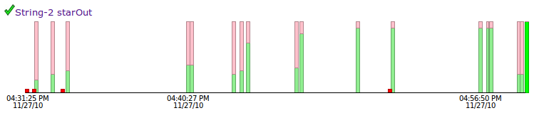
The above graph represents about 30 minutes of work. The short red marks at the bottom represent compile errors, where the code does not run. The bars with green on the bottom and pink at the top represent runs where the code is correct for some some but not all of the tests. Finally when the code works for all the tests, you get a nice solid green bar.
CodingBat is all about practice, working at a problem that is a stretch for your abilities and becoming stronger in the process. The Progress Graphs are just a kind of cute view into that process. My hope is that, like a mountain climber seeing the top of the mountain slowly get closer, the graphs illustrate your progress made of many difficulties leading to each success.
My favorite graphs are like the one above. The person is taking on a problem which is a challenge, and so there are lots of failed attempts. What's most important is that they do not give up; they keep working at it, and eventually figure it out. Step by step, that's how you learn. If a graph is really short, the person was probably not challenging themselves.
I've missed more than 9000 shots in my career. I've lost almost 300 games.
26 times, I've been trusted to take the game winning shot and missed.
I've failed over and over and over again in my life. And that is why I succeed.
-Michael Jordan
Progress graphs are available from a few places...
The done page for a user includes an option to show the graph for each problem. There's also a link below the big green checkmark when you get all the tests to pass for a problem to see the graph for just that problem.
It was fun to look at random graphs as I developed this feature. Therefore I made random graphs available for everyone -- each problem page includes a Random User Graph links at the bottom -- e.g. Random User Graph makeBricks() or Random User Graph nestParen() -- showing randomly selected progress graphs for a problem. Keep in mind that the range of programming experience of people on CodingBat is extremely large ... from people just learning to program, to current Google employees who are just playing around, so you will see some very short and some very long graphs. The random selection only includes graphs of length 3 or more. The dates and times shown on the graphs are for the local time zone of the browser (i.e. your time zone). The "2:00 AM" on the graph is the time expressed in your time zone when the person did the problem; the person doing the problem probably livesome where else on our spinning globe, and it was probably not 2:00 AM for them. For privacy, there's no way to know who is behind each graph and since they are random, you can't bookmark them. If you want to keep one, take a screenshot. (The graphs are drawn using the HTML5 Canvas. I wish the browser provided a feature to "grab" the pixels of the canvas.)
Playing around with the graphs, it was naturally fun to see the really long, "epic" graphs where someone had worked on a problem quite a lot before solving it. I added the Random Epic Graph feature if you want to see a randomly chosen epic graph. It's like watching an ant carry a twig much bigger than themselves, making progress inch by inch. Hang in there little guy, you can do it! To qualify as epic, I used the arbitrary cutoff of 50 steps or more which appears to show a good mix of interesting graphs. I've seen graphs of more than 200 steps. Sometimes the attempts are so close together in time, you cannot see the separate attempts on the graph.
I wrote the back-end data handling for this feature. However my wife, Katie Capps Parlante created all the display code, since she wanted an excuse to learn that sort of coding. Katie used the open source protovis library, which is specialized for data visualization in the browser. The drawing of the graphs uses HTML5, so to see them you'll need a browser with excellent HTML5 support like Firefox, Safari, or Chrome. Unfortunately, Microsoft IE8 is not good enough.
Mostly the graphs are just for fun. I hope they give the students a sense of their own struggles and progress. I do not recommend you use the graphs for grading. In particular, I strongly advise that you do not grade students based on how quickly something is solved. Emphasizing speed works at cross purposes to learning to solve the problems well. If you grade on speed, the students could delete and re-create their solutions use a different account or whatever to appear to solve the problems quickly. The best incentive to encourage learning the material is simply that the more problems the students solve, the better. I also recommend that you tell students that your exams will then involve writing little code segments just like on CodingBat, so time spent struggling with problems on CodingBat is a good investment for the exam.
It happens that by looking at the graphs, you may get a feeling of which students might be cheating a bit, since pasting in a solution looks so different from actually doing the problem. It's hard to tell for sure of course. It will certainly make cheating a more labor-intensive affair, so maybe the students will be encouraged to do the right thing and actually learn the problems. At Stanford, I always give code-writing exams that are very similar to the homework problems, and have the policy that an F on the exam gets an F in the course, no exceptions. So if someone cheats on the homework problems ... well it doesn't work out for them. Of course I tell them all this the first day, so hopefully they appreciate that making an honest effort on the homework problem is the right way to do well on the exams and of course this incentive structure helps them to actually learn the material.
Well if you've read this far, I have to admit that I'm not sure how well these graphs are going to be received. If they amuse people a little and encourage them to not give up, then great. If instead the graphs discourage people at how much work it all is, then I should take them out.
There is a classic learning error that can get in a student's head:
Everyone else is so much faster at this than me. I'm never going to learn this.
It can feel that way, but in fact everyone is a beginner at some time, and as you can see from the random graphs everyone has all sorts of struggles on the way to solving these problems. The key is to not give up. Anyway, my hope is that the graphs help people see the necessary struggle and iteration that goes into learning anything difficult.
Feel free to email me if you have any thoughts on this feature: nick.parlante@cs.stanford.edu